August 15, 2010

Inger Waage


Continuing on the theme from the previous post, I would like to present another great Norwegian female artist from the previous century: Inger Waage. She was a designer at Stavangerflint and Figgjo Fajanse from 1953-1979. Her work was incredibly popular at the time (and still is), and I think absolutely every Norwegian home has at least one item by her. But although her work is well known, very few know the name of the designer behind it. This web page has collected a lot of information about her and some of her fellow designers at the time, and there is a fair amount of information also in English. There are also an impressive collection of pictures of her work scattered around. If you follow the top entry under 'Linker' you will find examples of almost everything she made. There is also a video showing some of her work on YouTube.


August 13, 2010

Agathe Hjelvik


I found this great hand drawn poster at a second-hand shop today, and it was love at first sight. It is signed ‘Agathe Hjelvik’, but is not dated.


The shop had no information about where it originally came from, or who the artist was. But it was one of a total of four posters by the same artist, and one of them had the year 1928 on it, so we assumed that they were all from about the same period. I have made a few inquires to try and find out more about her, but so far I have come up with nothing. It seems there are very few records of artist from this period, especially if you did commercial work, not to mention being a woman. So I'm imagining she must have been one cool chick - a creative working woman at a time where this was less common. Drawing inspiration from Art Deco, the Far East and Bauhaus...?

July 30, 2010

Porcelain bling


A new batch of porcelain rings with letters fresh out of the kiln. If I now could fiure out their sizes I might try and put some of them in my Epla shop.

July 29, 2010

Spoon frustrations

Sometimes the distance from initial idea to finished product is longer than anticipated.

I had visions of making a white porcelain spoon, wafer thin and elegant. A few weeks ago I went to work making a plaster cast from a spoon found at my grandparents. It is pretty thin and delicate, so I added clay to the back of it to make it a bit thicker. In the last couple of weeks I have been trying to cast the spoon, but it has proved to be a tough nut to crack - they keep breaking at the ‘neck’! I think the profile of the spoon I picked is just too curvy, so that the weight of it creates a weak spot right there. I have tried pouring and pressing, drying on its belly and on its back, drying in the mould and building small scaffoldings underneath it, but after eight broken ones I am about to throw the whole thing at the wall. So in an attempt to try and get at least one spoon through both firings, I press molded a very crude one in sturdy stoneware. And ta-da! Here it is: one finished spoon! Not at all what I set out to make, but still - a spoon in one piece! Will keep trying on the porcelain one, and eventually I’m sure I’ll get there. But in the mean time I’ll enjoy this small victory.


July 26, 2010

Viruses, Holidays and Shrinkage

I’m back! You might not have known I was gone, but last week I got a nasty virus on my laptop, so for the last five days I have been without a computer. It has really brought home to me how many parts of my daily life involves being online. How do you find a computer-repair-man in a hurry without doing a quick search online? And when I found one, how I wished I could have searched for the address on a map to find their offices out in an unfamiliar suburb. And that was just within the first five minutes ... But of course there are upsides to it as well. Without a computer I had to postpone some of the work I was planning on doing, and could go here for a few days ..


Today I also picked up the first ducks made using my new plaster casts. I have tried out two different types of porcelain clay, and if you look closely you might see that they are slightly different in color. They have also shrunk a lot in firing, so now they look like little ducklings next to the original duck.

July 19, 2010

Printers blocks: Snakeoil

Today I thought I'd show you two more of my old printers blocks, this time with a medical theme. The first one is a bottle of milk of magnesia by the Philadelphia Magnesia Co.

" For relief of acid condition. An effective but gentle laxative".

Yep, every home should have one. I think this block was a genuine advertisement for the product, and it is really detailed and in pretty good condition.


The second one I was more unsure of. It says:

"German Liquor Cure. Sure cure for drunkenness. Stop drinking. Sold only by Sears Roebuck and Co".

The rest is kind of hard to decipher. Because of that, and the whole 'cure'-thing, I thought this might have been an advert for a novelty product, for instance some kind of sweets? But then I found this online, and what do you know, in 1902 there really was a cure for drunkenness!


July 18, 2010

Summer morning walk

Below are a few snaps taken this morning, on my way from from my apartment to my studio. On a lovely summers morning like today it does not feel like you are in the middle of a city at all. It is all greenery and the smell of linden trees and old roses.


July 13, 2010

New Font

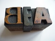
Still no sign of the roller runners I ordered a month ago. The little Adana is sitting idle on my kitchen bench, and it is becoming very frustrating not to be able to do anything with it, just because of one tiny missing part. But, something else came in the mail today: a new set of wooden fonts!


It is from the Stephenson Blake foundry in the UK, but I do not know what font or how old it is. But it looks lovely!

July 10, 2010

Paper

I have absolutely no idea what I'm going to use these for, but they followed me home, so I guess now I have to keep them...

July 04, 2010

Concrete Poetry

A definition of concrete poetry from Encyclopædia Britannica:
'Poetry in which the poet’s intent is conveyed by graphic patterns of letters, words, or symbols rather than by the meaning of words in conventional arrangement. The writer of concrete poetry uses typeface and other typographical elements in such a way that chosen units - letter fragments, punctuation marks, graphemes (letters), morphemes (any meaningful linguistic unit), syllables, or words (usually used in a graphic rather than denotative sense) - and graphic spaces form an evocative picture.'

'Silence' by Eugen Gomringer


'Stability' by Clemente Padín


'Subtraction (Startling)' by Tauba Auerbach


'Archives' by Edwin Morgan


'Obstacles and Impediments' by Mary Ann Sampson

June 26, 2010

Making plaster casts

This weekend we had a plaster cast workshop at the pottery studio, held by plaster-caster-extraordinare Kjersti Lunde. Great fun, and a lot more to it than what I in my ignorance had thought. Pictures of my evolving projects below.

The finished production, which now has to dry out for about a week or so before I can start using them. Can't wait!

June 22, 2010

Grafitti

This is one of my favourite grafitti walls in Oslo, at Blå -in an old industrial area by the river, which has been convertet into a private art school and a music venue, amongst other things. The piece has been there for quite some time, but now it has started being painted over, so I thought I'd better take some pictures before it is all gone...


(For a closer look, you can click on the pictures.)

June 11, 2010

An Adana 3x5!

It will still be a while before I get the Adana 5x8 I ordered a few weeks back. Refurbishing takes time. And while impatiently waiting for it, I did something I promised myself that I wouldn’t: I impulse bought one on Ebay! And a 3x5 to boot!! I had already decided that it would be too small to be very useful, and that I was going to spend my hard earned cash wisely on essentials only! Right. Redeeming factors are that it was very reasonable, and the very nice seller was kind enough to include a full starter kit for me.

Today it arrived, and I have to say it is lovely to finally have a press, even if it is a Mini! It looks to be in good condition, and it came with all kinds of great extras.


I had to give it a quick test run, just to see if I still remembered anything from the workshop. And I remember some, but certainly not all of it. Hopefully it will all come back to me as I continue working with it. It generally seems to be very similar to the 5x8 Adana, with a few minor differences. For instance there is no typeman padding bale, and the chase is held in place inside the bearer chase by screws.


The rollers moved very awkwardly over the chase, roller bearers and bearer chase, and it took me a while to realize that I am missing roller runners. In the mean time I had covered everything in ink, but luckily I did not ruin the rollers, and all the ink can be cleaned off. I have now ordered roller runners, and don’t think I will risk using the rollers any more until I get them. And then I guess there will be a lot of tinkering and tweaking until I, hopefully,  get a good, even impression. But at least I’m on my way! Hurra!!

June 10, 2010

Summer market


It is time for another market at the pottery studio this weekend. As usual I have not had time to make much, but my fellow 'workshoppers' have been producing non-stop for the last cople of months, so there should be a lot of ceramics up for grabs. And of course there will be cake! So if you are in the area, you are hereby invited to stop by and say hello.

Update: The weather was not the best, but we still had a fun weekend. Lots of people stopped by. And I sold most of my nerikomi pieces, hurra!.

June 06, 2010

Porcelain jewlery

Some of the finished jewlery. The clouds became brooches, the rest became  rings.

Related Posts with Thumbnails